Name: Wong Li Wei
Student ID: 0364538
Assignment: Task 1 Exploration (20%)
Tutor: Mr. Martin
Course: Bachelor of Fashion Design Technology
________________________________________________________________
Table Of Contents
1. Instruction
2. Design elements
3. Assignment outcome
4. Feedback
1. Instruction
__________________________________________________________________________
2. Design elements
Point

A point serves as a repetitive mark that forms a line. As the point moves through space, it generates various 2D and 3D shapes and forms.
Line

A line links any two points and is effectively used to separate or create space between elements or to establish a central focus.
Types of line:
- Vertical lines
- Horizontal lines
- Diagonal lines
- Curved lines
Shape

Shape refers to the expanse within the outline of 2D area or within the 3D object. It will become visible when a line or lines enclose an area or when an apparent change in value, colour or texture sets an area apart from its surroundings.
Categories of shapes:
- Geometric shapes
- Organic shapes
Form

3D area is normally named as form. Hence, when form encloses space, the space will be volume.
Texture

Texture refers to the physical feel of a surface or the visual depiction of its tactile characteristics.
Categories of texture:

- Actual texture (experienced by touch)

- Simulated or implied texture (created to look like real texture)
Space
.png)
Shape is an abstract and universal container for all things, encompassing the seemingly empty space around us. In graphic design, space is categorized as positive (occupied space) or negative (empty space), created through depth by overlapping elements, varying sizes, placement, and perspective. Additionally, 3D space is perceived through our own position relative to people, objects, surfaces, and voids at different distances. From an external view, we experience mass, while internally, we perceive volume.
Colour

Colour is what we see when light interacts with a surface, either passing through a transparent material or being absorbed and reflected. It is also the wavelengths of light that our eyes detect from a reflected source.
Types of colours:
- Hue (colours of the spectrum, such as yellow and green)
- Value (lightness or darkness from white through greys to black)
- Intensity (purity of a hue)
- Colour schemes (colour groupings that provide distinct colour harmonies)
- Monochromatic (based on variations in the value and intensity of a single hue)
- Analogous (based on colours adjacent to one another on the colour wheel which each of it contain the same pure hue)
- Complementary colour (two hues directly opposite each other on the colour wheel)
_______________________________________________________________
3. Assignment outcome
Gestalt theory
- Principle of closure

The design work demonstrates the principle of closure, as the audience's mind automatically fills in the missing details to complete the image. Hence, when audiences see this design work, their first thought will most likely be a light bulb, as the posture of the human hand resembles a glass bulb that can be combined with the cap.
- Principle of similarity
.png)
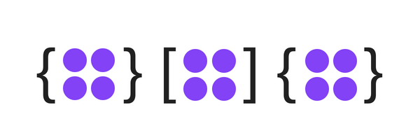
The design work demonstrates the principle of similarity, as the human eye tends to perceive similar elements in a design, even when the elements above are separated. As a result, when the audience sees this design work, they will notice that the colours of the circle shape are different and separated, but the elements are in the same shape.
- Principle of continuation

The design work demonstrates the principle of continuity, as the human eye will take the smoothest path when viewing lines, regardless of how they were drawn. As a result, the design work uses curve lines to smoothly guide the audience's eye from one part of the composition to the next.
- Principle of proximity

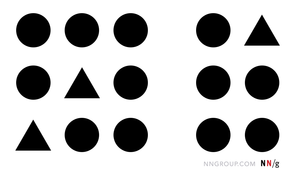
The design work demonstrates the principle of continuation by describing how relationships develop between things that are close to one another. According to the design work, even though the shapes are different, they are seen grouped because they are close together. As a result of their placement, the audience will immediately notice that the shapes are connected to one another.
- Principle of figure/ground

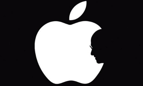
The design work illustrates the principle of figure-ground, where elements are naturally perceived as either prominent in the foreground or subtle in the background. In this case, the apple logo serves as the figure, standing out in the forefront, while the human face fades into the background.
- Law of symmetry & order

The design work shows law of symmetry, as the mind perceives objects as being symmetrical and forming around a center point.
- Law of uniform connectedness

The design work demonstrates law of uniform connectedness, as people see visually connected elements or ones with common characteristics to belong to the same group or unit.
- Law of prägnanz
.png)
The design work demonstrates law of prägnanz, as people will perceive complex things as simplified forms in order to easily recognize the world around them.
- Law of common fate
.png)
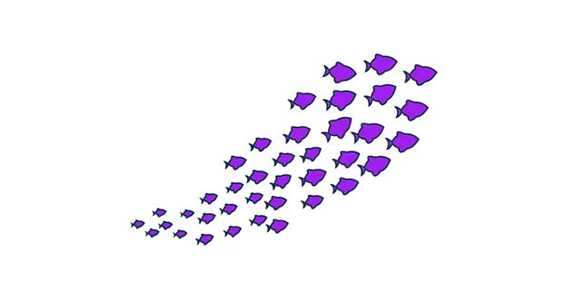
The design work demonstrates law of common fate, as when elements move together, humans see them as a group as human nature associates objects that share a common motion.
Contrast

The artwork is created by Ariel Sun, who has a collection of drawings based on the concept of color contrast. In this piece, the artist used complementary colors which are also orange and blue, in order to enhance the overall contrast.
Emphasis

The artwork, titled Flamingos on the Beach, Wildlife Surrealism Birds, Nature Flamingo Fantasy Beach Summer Photography, first captures our attention with the two flamingos. Their enormous size compared to the miniature humans on the beach makes them the focal point of the artwork which creates a strong sense of emphasis.
Balance

The artwork is titled Swan Rush. It is evident in the artwork that both sides are identical, including the background elements and the design of the swans. This demonstrates symmetrical balance throughout the artwork.
Repetition

The artwork is designed by separating each set of lips into individual boxes. Each set of lips features a variety of patterns, while the shape remains consistent, creating a sense of repetition throughout the artwork.
Movement

The artwork is titled Dancers 9. It clearly depicts a dancer in motion. To enhance the mysterious and abstract expression, the artist experimented with movement through the medium of dance. The dancer is surrounded by blurry lines, which convey a sense of movement throughout her entire body.
Harmony & Unity

The artwork mainly focuses on the mermaid in the center. To create a sense of harmony, the artist designed the mermaid’s costume using sea plants, while the hair and facial features incorporate sea creatures. Moreover, the background includes sea water, enhancing the underwater theme. Hence, the use of underwater elements in the artwork gives the audience a sense of oneness.
Symbol

The design is a stop sign for road traffic. Its overall design is based on an octagonal shape, which is a geometric shape, and the use of red helps drivers become aware of road traffic. Hence, the stop sign represents an arbitrary symbol.
Word and Image

The design work shows design principle of word and image, as it effectively uses visual elements and text to convey a clear message. Hence, as the text and image works together well, it allows the overall design to be more engaging.
Selected Artwork/Design work

Reasons of why choosing this artwork
The design work, titled "All in Your Head," captivates me due to the arrangement of words and patterns above the title. These words symbolize the unspoken thoughts and emotions that people often keep within themselves—stress, inner voices, and feelings that are difficult to express. As a result, others remain unaware of our struggles, as we tend to present a cheerful and positive exterior, much like the girl depicted in the artwork.Additionally, the rows of varying patterns contribute to the sense of mental clutter, representing the chaos within a person's mind. When overwhelmed or lost for words, our thoughts can become jumbled, making it difficult to articulate our feelings clearly. This aspect of the design effectively conveys the confusion and messiness that can arise in moments of stress or uncertainty.
The overall composition of this piece is straightforward and immediately communicates the designer’s intended message. It delves into the complexity of the human mind, skillfully blending classical imagery with a contemporary artistic approach. The black-and-white arrangement, enriched with intricate, precisely cut-out elements, adds depth and visual intrigue, making the narrative both compelling and thought-provoking.
Design principles that are included in the artwork
Harmony and Unity- Unity is effectively achieved through the consistent use of typography and patterns, creating a seamless blend within the artwork.
Gestalt theory (Principle of proximity)- The principle of proximity is demonstrated by the closely grouped rows of text and patterns, making them appear as a unified whole rather than separate elements.
Contrast- The maximum contrast colour of black-and-white color scheme ensures that the typography and illustrations stand out against the white background.
Hierarchy- The title "All in Your Head" is the most prominent element due to its size, boldness, and central placement, establishing a clear visual hierarchy that directs the viewer’s focus.
Movement- The arrangement of text and patterns naturally guides the viewer’s eye from top to bottom which create a smooth visual flow.
Repetition- The repeated rows of patterns and text reinforce unity and consistency, making the composition visually cohesive.
________________________________________________________________
4. Feedback
Week 2
Week 3
For the gestalt theory, I need to include all of the principles and laws. Then, for the word and image section, I need to choose the picture again, as the words do not relate to the picture well. Lastly, I also need to rethink my artwork selection properly, as it will relate to tasks 2 and 3.
Comments
Post a Comment